.png)
Health Apps often focus only on physical health (hydration, step goals etc), mental health isbeing left out.
Health advice and resources are overwhelming and sometimes not credible. There’s alot of false information (especially diet advice) on the internet. This might be confusing or evendetrimental to users health - reaching a step goal and drinking water isn’t enough!
Health Apps are often not personalized to one user. Everyone receives the same suggestions.
„Users need a guided way to guarantee a path to better wellbeing through reliable and personalized information. Finding information about this topic is overwhelming and time consuming.“
This App puts a great focus on improving users mental health as well as their physical
health. Mental health is equally important as physicalhealth and they influence eachother.
Information submitted by experts in the field provide credible and reliable advice.
The App updates it’s suggestions for users regulary with every input they make. For
example by filling out surveys, that define the users‘ current situation and future goals better.
The most important factor for health is consistency. Users will be rewared for every task, every good behaviour to stay on track.
.png)
Researching several competitor Apps showed that they are often:
Subscription based
Focusing on only one aspect of health
OR
Trying to combine far too many
Finding: Combining the most valuable features into one single free App

I interviewed 3 participants 1 on 1 while recording our conversations.
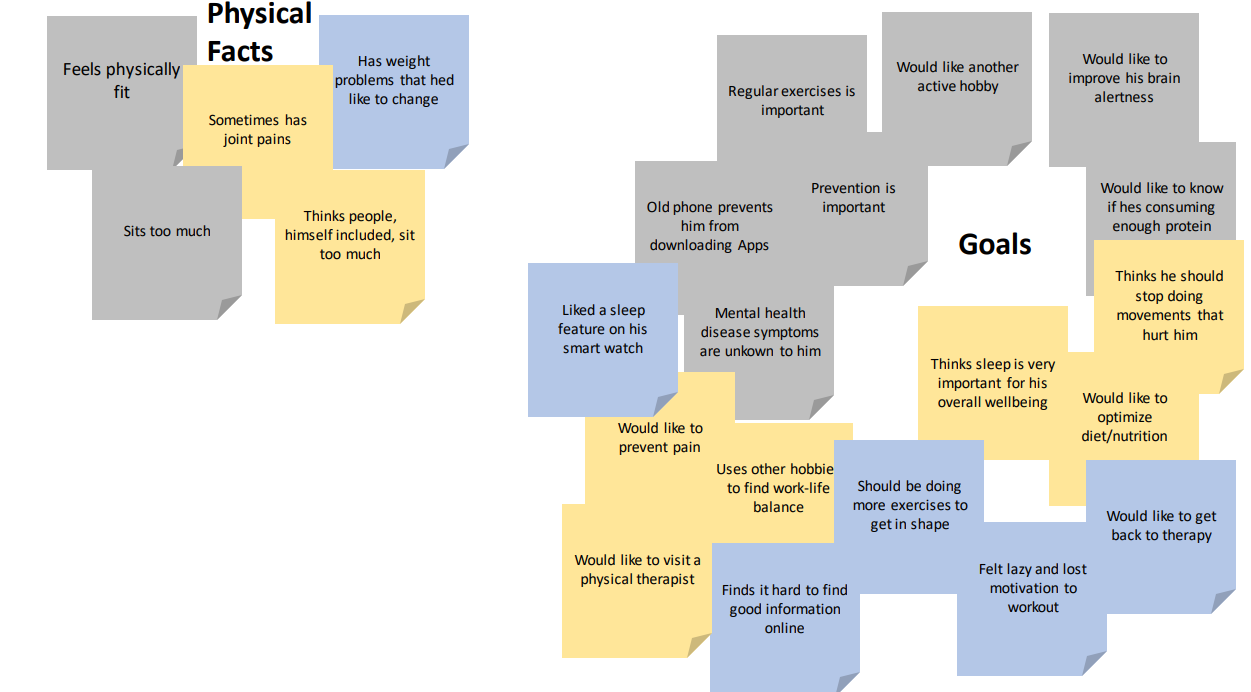
As a step to break down all the data I collected during interviews I created an affinity map. Key findings that I wrote down during interviews are arranged on sticky notes and color coded by participant. Similiar findings are then rearranged into groups that visualize and organize them.
On the next slide I present the insights I drew from these findings.


What's important to the users:

User personas are a fantastic tool for bringing our insights to life and giving our research a face and narrative. This is not only important for the product team and stakeholders, but also makes our research more memorable and relatable.
The following two personas represent our main target audience.
„I think I’m already pretty healthy but sometimes I get overwhelmed by all the information that is out there and I don‘t know who to trust“


„I tried losing weight by doing workouts at home but I lost motivation“
„I don’t know common symptoms of mental illness”

User flows are important to keep our focus on the experience of the User while using the App. It shifts the focus from each individual page to the experience as a whole. They are also the first step to discover all pages that are needed without forgetting something important or going overboard.
.png)
I sketched out the first iterations of wireframes with pen and paper. Following the user flows I created all necessary screens and designed the UI elements in an intuitive manner. Transferring the paper wireframes to Balsamiq, I created the first low-fidelity prototype.


As a step to test my created wireframes and user flows, I conducted a usability test using a clickable mid-fidelity prototype. This process included recruiting participants, writing a test script, conducting the remote usability tests while interviewing the users and then analyzing the findings.
These are my findings organized into categories and color coded by participant:

For detailed information feel free to check out these links:
Detailed analysis of the testRainbow sheet
Finally I created high-fidelity wireframes and turned them into a clickable prototype using Framer.
The UI follows the basic visual design principles, incorporates emotional design and makes use of grids and spacing. I included some slogans that visualize the purpose of this App and hopefully highlight the usefulness.

The biggeset challenge for me was not losing sight of the UX while trying to make the UI as visually appealing as possible.
A lot of ideas, that I thought would ‘look’ good, ended up impairing the usability. I had to take a step back and focus on using ‘decorative’ design elements only when they were adding to the usability.
Additionally I often noticed my personal bias influencing my design decisions, which led me to making more iterations than necessary (changing things to the way I like them, then noticing my bias and changing it back to what I think the Users would prefer).
The best way to tackle these challenges is being aware that they exist. This way I’ll be able to change my way of thinking before I run into problems.
After finishing this project and revisiting a couple of weeks later I decided to iterate on the UI-Design again. This time I aimed to create a cleaner and simpler UI that focuses on the User-experience without distracting color elements. I designed a more neutral UI, including sharper corners, less colors and neutral icons. This aids in making the App appear more professional and polished.

.png)
.svg)